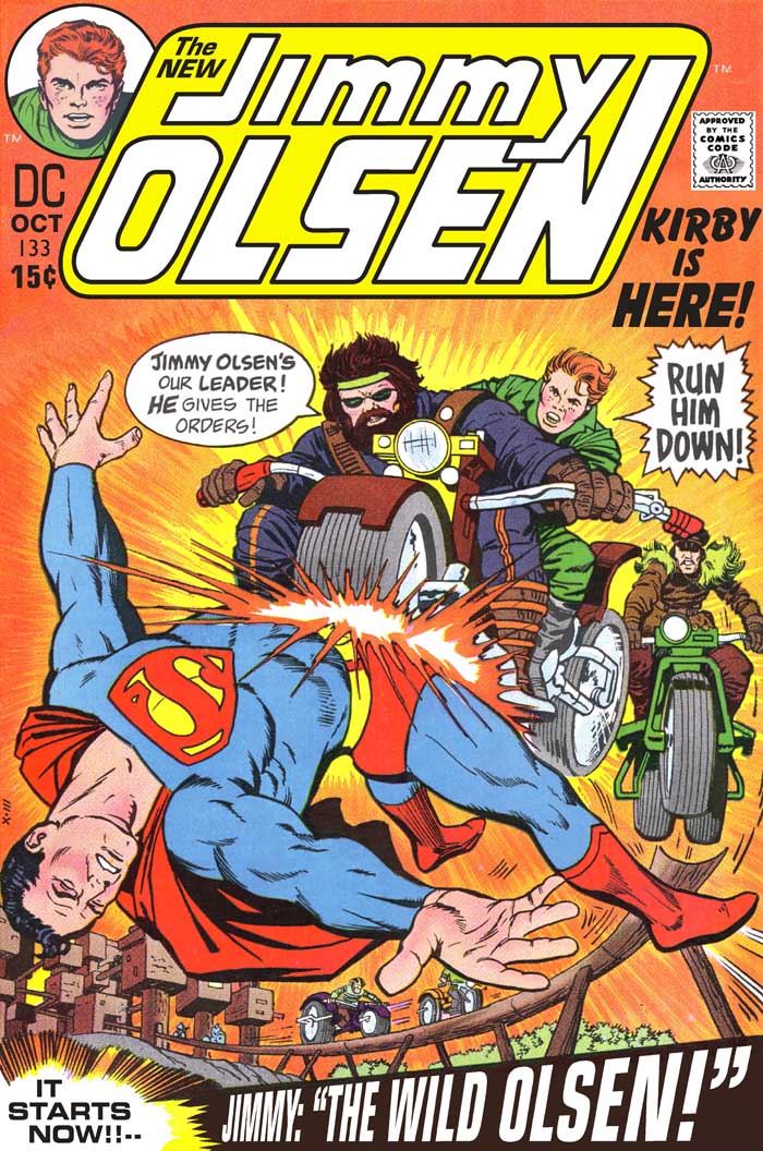
The SUPERMAN logo is a thing of beauty-- that's why it's lasted so long-- but not when it was plastered on JO. So, out it went. Also, the JO logo itself may have been fine, in 1951. With so much emphasis on "KIRBY IS HERE!", and it being "THE NEW" Jimmy, it sure seems this would have been the time to re-design the logo... NOT, right after Jack left the book. Also, for Jack's entire run, Jimmy was seen sans bow tie. But he still had it in the corner pic, where he & Superman just STAND there, Supes' arm on Jimmy's shoulder. To me, that pic screams, "Look! This is a really BORING comic! Please buy us ANYWAY!" Well... not anymore! Finally, "GUN HIM DOWN!" made sense on the rejected version, where Yango was actually holding a gun. Here, "RUN HIM DOWN!" seems more appropriate.
JIMMY OLSEN 133 / fantasy version
JIMMY OLSEN 134 / fantasy version
JIMMY OLSEN 135 / fantasy version
JIMMY OLSEN 136 / fantasy version
JIMMY OLSEN 137 / fantasy version
JIMMY OLSEN 138 / fantasy version
JIMMY OLSEN 141 / fantasy version
JIMMY OLSEN 144 / fantasy version
JIMMY OLSEN 145 / fantasy version
And now, for something different...
here's the COLOR GUIDE for FOREVER PEOPLE 9
Another oddball item... I wanted to clean up some of the text, and get the Comics Code stamp off the lighthouse light. I couldn't see what it was at first!
THE SHADOW 11 / Fantasy Cover
More as I go!
Once again, for in-depth reviews, go to the CAPTAIN COMICS message board...
Artwork (C) DC Comics Inc.
Restorations by Henry R. Kujawa


No comments:
Post a Comment